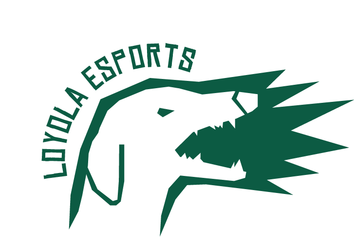
Loyola Esports Logo
Original Rough Sketch:
The Process
Loyola Esports was one of the first logos I would create and as a result I learned some very tough lessons. I did this work in Sophomore year of college when I first assumed the role of Chief Designer. The organization’s Vice-President explained that the team needed a new logo as our old one made it difficult to create a clear brand identity. I was given two prompts, one where I could go wild and do whatever and one to create a crest.
Crest Logo
Crest Logo
The First Logo I was prompted to create was a crest similar to those predominately used in soccer clubs (take for example Arsenal or FC Barcelona. A crest was also in line with Loyola University Maryland’s Logo which in some cases features a crest predominately. I had a hard time coming up with what would be featured in each segment of said crest. After a bit of thinking I eventually settled on the bridge over Charles St. as it is one of Loyola’s most famous landmarks (so famous the school created an app named “The Bridge” for student events). I also wanted to add the very recognizable checkered part of the Maryland flag. These two things together denote that this logo is distinctly for Loyola University Maryland. For the final two segments I decided on a blue gaming controller and a red mouse that are seemingly connected together between segments. This was done for a couple of reasons:
1) Red and Blue are often the two sides used in most video games to show the in-game difference between teams.
2) The mouse and controller shows that our club supports people who play both console and PC games which is a very important distinction
3)The wires connecting the two despite being in different segments is an analogy for how video games connect the different people in our club despite differences in background, religion, gender, and race.
Hound Logo
Hound Logo
For this second logo I took inspiration from our school’s mascot, the greyhound. The only issue with a greyhound is that it is an objectively silly looking dog. I did research on other Esports logos and I found a solution. What if I focused more on the bark than the actual dog. Barking relates to calling and voice communication something that is a very important part of any Esports team worth their salt. So I honed in on the bark creating a logo with rigid edges in order to give off a more grizzled vibe. All in all, I think I was successful in making a silly animal menacing and I prefer this logo to the crest.
Lessons
Learned
Unfortunately no one told me that the school had a set of hard rules about club sport logos. As a result all of the work I did on the logos had to be canned and our vice president had to make a weak logo based on a template. Now I know to ask more questions and make sure everyone is on the same page about what is required when I am given a task.


